
Color Psychology in UI Design: How Colors Influence User Behavior and Engagement
Colour Psychology Elevates UI Design in SaaS for U.S. Audiences
Color psychology in app design is the strategic use of color to influence user emotions, perceptions, and behaviors.
In 2026, it is treated as a functional communication tool rather than just an aesthetic choice, directly impacting brand recognition and conversion rates.
Emotional Impact of Key Colors
Specific colors trigger subconscious responses that guide how users interact with an interface:
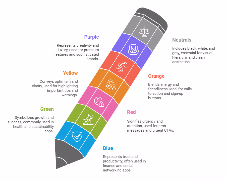
- Blue: Trust, security, and reliability. Most common in fintech and corporate apps (e.g., Facebook, PayPal).
- Red: Urgency, excitement, and danger. Used for notifications, error states, and urgent call-to-actions (CTAs) (e.g., Netflix, YouTube).
- Green: Growth, health, and success. Frequently seen in wellness and sustainability apps (e.g., Spotify, Calm).
- Yellow: Optimism, clarity, and attention. Often used for highlight elements or fun-focused apps (e.g., Snapchat).
- Orange: Energy, friendliness, and impulsiveness. Effective for creative or action-oriented environments (e.g., Duolingo).
- Black/White: Sophistication, power, and minimalism. Apple heavily uses this to convey a premium, high-end feel.
Core Design Principles for 2026
Modern UI design uses established rules such as the 60-30-10 rule for color distribution and semantic colors to instantly communicate feedback.
Visual hierarchy is also important, directing users' attention with contrasting colors.
Strategic Best Practices
Key considerations include prioritizing accessibility with sufficient contrast ratios, being mindful of cultural color meanings, and using A/B testing for data-driven decisions.
Trending color palettes in 2026 include "Digital Nature" and "Retro Futurism".
Table of Contents
- Understanding Color Psychology in UI Design
- Deconstructing the Spectrum: Core Color Psychology Applications
- Color Psychology Applications in Mobile App Design
- Crafting Your Palette: Best Color Palette Generator Tools and Strategies
- Real-World Impact: Case Studies in Color Psychology Mobile App Design and SaaS
- Addressing the Clicks Challenge: Ranking vs. Converting
- Future Trends in UI Color Psychology for U.S. SaaS Companies
- People Also Ask Section
Color Psychology in UI Design
Every color tells a story, even before a user reads a single word. In user interface (UI) design, this visual storytelling is paramount. Color psychology in UI design is the study of how colors affect user behavior and emotional responses within a digital interface. For SaaS companies, especially those serving the U.S. market, understanding these subconscious cues changes everything.
For example, a fintech SaaS product aims to convey trust and security, while a creative collaboration tool might prioritize innovation and playfulness.
The colors chosen for their UI directly contribute to these perceptions.
Why Color Matters More Than You Think for Your SaaS Product?
Consider your favorite SaaS applications. What emotions do they evoke? LinkedIn uses blue, synonymous with professionalism and reliability. HubSpot employs a vibrant orange to suggest energy and friendliness. These are calculated decisions based on the psychological impact of color.
In the U.S. market, where consumers are bombarded with countless digital experiences daily, a well-crafted color scheme can be the differentiating factor that captures attention and fosters loyalty.
Color impacts several key areas of user experience and business outcomes:
- Emotional Connection: Colors evoke specific emotions, from calm and trust (blue, green) to urgency and excitement (red, orange).
- Brand Recognition: A consistent and unique color palette helps users instantly recognize and recall your brand. Research indicates color can increase brand recognition by up to 80%, according to the University of Loyola, Maryland.
- Usability and Navigation: Strategic color use guides users' eyes, highlights important information, and improves readability.
- Conversion Rates: The right color on a call-to-action (CTA) button significantly influences clicks and conversions. A classic HubSpot study found red CTA buttons outperformed green ones by 21% in conversion rates. Another independent analysis noted strategic red use can increase conversion rates by up to 34% during promotional events.
- Perceived Trust and Professionalism: Critical for SaaS products handling sensitive data or crucial business operations, colors like blue or gray often instill reliability. For instance, 42% of individuals associate blue with reliability, influencing trust and security among users.
Color Psychology Applications in Mobile App Design
To leverage color effectively, understand the common associations each color carries, particularly for a U.S. audience.
Blue: Trust and Productivity
In the U.S., blue is widely perceived as reliable, trustworthy, and stable. Many B2B SaaS companies, especially in finance, enterprise software, and social networking, feature blue in their interfaces.
- Use Cases: Dashboards, corporate tools, login screens, confirmation messages. Think of Salesforce, Slack, or Zoom – their interfaces heavily use blue to convey reliability and efficiency.
- Psychological Impact: Calmness, security, professionalism, logic, focus.
- Avoid: Overuse can sometimes feel cold or detached.
Green: Growth, Harmony, and Success
Green links to nature, growth, and renewal. For SaaS products, it often signifies success, sustainability, and health.
- Use Cases: Success messages, "saved" notifications, positive feedback, progress bars, environmental or health-tech applications. Asana uses green for completion indicators, reinforcing achievement. Users interacting with green elements report a 23% higher satisfaction rate.
- Psychological Impact: Freshness, prosperity, balance, health, and often, money.
- Avoid: Certain shades can evoke jealousy or sickness if not carefully chosen.
Red: Urgency, Passion, and Attention
Red is a powerful, attention-grabbing color that signals importance, urgency, or passion. Use it sparingly but effectively in UI design.
- Use Cases: Error messages, warning notifications, "delete" buttons, urgent CTAs, or elements requiring immediate user attention. Netflix and YouTube use red to signify excitement and engagement.
- Psychological Impact: Energy, excitement, danger, urgency, love, strength.
- Avoid: Too much red can overwhelm, create anxiety, or suggest aggression.
Yellow: Optimism, Clarity, and Attention
Yellow is bright, cheerful, and highly visible. Use it to draw attention to specific elements or to convey optimism.
- Use Cases: Highlight important tips, warnings, or new feature announcements. Amazon uses yellow for its "Add to Cart" button, creating a sense of impulsiveness and happiness. Approximately 30% of marketers noted enhanced user engagement through yellow accents in their interfaces.
- Psychological Impact: Happiness, optimism, warmth, creativity, caution.
- Avoid: Can be tiring on the eyes if overused, or appear inexpensive if the shade is poor.
Orange: Energy, Friendliness, and Call to Action
Orange blends red's energy with yellow's happiness, making it a friendly and action-oriented color.
- Use Cases: Calls to action, discounts, sign-up buttons, or areas designed to encourage interaction. Duolingo uses orange for an energetic and playful learning environment. Bright colors like orange can boost click-through rates by up to 24%, making them ideal for call-to-action buttons.
- Psychological Impact: Enthusiasm, creativity, determination, warmth, success.
- Avoid: Can sometimes appear childish or lack seriousness for certain professional SaaS contexts.
Purple: Creativity, Luxury, and Sophistication
Purple often conveys creativity, luxury, and wisdom. It's less common in mainstream SaaS UIs but effective for niche products.
- Use Cases: Premium features, exclusive content, creative tools, or brands aiming for a sophisticated feel. Twitch uses purple to signify creativity and community. About 27% of consumers perceive brands with purple color schemes as premium.
- Psychological Impact: Royalty, imagination, spirituality, ambition.
- Avoid: Can be seen as too feminine or whimsical if not balanced.
Black, White, and Gray: Essential Neutrals
These foundational colors are critical for establishing visual hierarchy, readability, and a clean aesthetic.
- Black: Power, elegance, sophistication. Often used for text, borders, or backgrounds in dark mode. Apple utilizes black and white for a minimalist, premium feel.
- White: Simplicity, purity, cleanliness, spaciousness. Essential for creating negative space and reducing cognitive load. Google and Airbnb heavily rely on white for clean, approachable interfaces.
- Gray: Neutrality, balance, professionalism. Used for secondary text, disabled states, or subtle dividers. Often seen in modern and functional interfaces.
Strategic Color Psychology Applications in SaaS UI
It's not just about picking individual colors, but how they work together within a holistic UI.
Our Product Engineering Services emphasize a systematic approach to color, ensuring consistency and purposeful application.
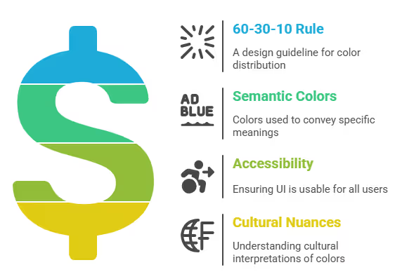
The 60-30-10 Rule: Balancing Your Palette
A widely accepted guideline in design is the 60-30-10 rule for distributing colors:
- 60% Dominant Color: This is your primary brand color, used for the majority of the UI. For a SaaS product, this often aligns with the core brand identity and the primary emotion you want to evoke. For example, a deep blue for a secure financial platform.
- 30% Secondary Color: This complements your dominant color and is used for secondary elements like subheadings, inactive tabs, or supporting graphics.
- 10% Accent Color: This high-contrast color is reserved for critical elements like call-to-action buttons, important notifications, or highlights that demand immediate attention. This is where your red or orange might shine.
Applying this rule ensures visual harmony and prevents the interface from feeling cluttered or overwhelming, which is particularly important for U.S. users who expect clean and efficient digital experiences.
Semantic Colors: Communicating Meaning Instantly
Beyond branding, colors should carry inherent meaning within your UI. This concept is "semantic colors," where specific hues consistently indicate standard states or actions:
- Green: Success, confirmation, positive feedback (e.g., "Your payment was successful").
- Red: Error, warning, negative feedback (e.g., "Invalid password," "Action failed").
- Yellow/Orange: Caution, warning, pending action (e.g., "Please review your details," "Trial expiring soon").
- Blue: Informational, links, primary actions (e.g., "Click here for more info").
This consistent use of semantic colors reduces cognitive load, allowing users to quickly understand the status of their interactions without needing to read extensive text.
For our Web App Development projects, we integrate semantic colors to create highly intuitive user flows.
Accessibility: Designing for Everyone
In the U.S., accessibility compliance (WCAG guidelines) is not just a best practice but often a legal requirement. Color psychology in UI design must always consider users with visual impairments, including color blindness.
- Contrast Ratios: Ensure sufficient contrast between text and its background. WCAG 2.1 recommends a minimum contrast ratio of 4.5:1 for normal text and 3:1 for large text. Tools like WebAIM Contrast Checker can help you verify this.
- Don't Rely Solely on Color: Never use color as the only means to convey information. For example, an error message should have an icon or text alongside the red color to ensure it's understood by everyone.
- Color Blindness Simulation: Utilize design tools that offer color blindness simulation to see how your interface appears to users with different forms of color vision deficiency. Approximately 9% of the population suffers from some form of color blindness, making this a critical consideration.
Cultural Nuances: A Global vs. U.S. Perspective
While many color associations are universal, some meanings can differ across cultures. For a U.S. audience, the associations discussed above (blue for trust, green for growth, red for urgency) are largely consistent and well-understood.
However, if your SaaS product expands globally, research specific cultural interpretations of colors to avoid unintended messages.
For instance, white, often associated with purity in Western cultures, can signify mourning in some Eastern cultures.
Crafting Your Palette: Best Color Palette Generator Tools and Strategies
Choosing the right color scheme is an art backed by science.
Fortunately, many tools assist in generating harmonious and effective palettes.
Top Best Color Palette Generator Tools
When starting a new SaaS UI project or refining an existing one, these tools are invaluable:
Strategies for Selecting Your SaaS UI Colors
- Start with Your Brand Identity: Your UI colors should extend your brand's existing visual identity. If your brand guidelines specify certain primary colors, these will often form the foundation of your UI palette.
- Define Your Product's Core Emotion: What do you want users to feel when they use your SaaS product? Trust? Creativity? Efficiency? This guides your primary color selection.
- Research Your Competitors (and Differentiate): Analyze the color schemes of successful SaaS competitors in your niche. While you can learn from them, ensure your palette has enough distinctiveness to stand out.
- Consider Dark Mode: Increasingly, users expect dark mode options. Design your palette with both light and dark backgrounds in mind to ensure readability and visual appeal in both settings.
- Test, Test, Test: Color perception is subjective. Conduct A/B tests on key UI elements (like CTA button colors) and gather user feedback. Tools like Google Analytics or Hotjar can help track how color changes impact user behavior.
Real-World Impact: Case Studies in Color Psychology Mobile App Design and SaaS
Our work involves designing and developing high-performance solutions for diverse industries, with color psychology playing a crucial role in user adoption and efficiency.
High-Performance Transformation for Leading Standards Organization
This project involved a large-scale modernization initiative to revamp a legacy system and improve performance, scalability, and user experience for a high-transaction platform. The focus was on engineering a future-ready solution capable of handling real-time GTIN and traceability label generation at scale. The UI design prioritized clear, functional layouts using professional color schemes to support complex data visualization and ensure user confidence in accurate, high-volume operations.
- 100% Performance boost delivered
- 30% Infrastructure cost savings
- 200% Bulk upload speed gain
Service Booking Platform
We developed a scalable service booking and post-service management platform for a leading on-demand, high-quality service provider. The UI for this platform used intuitive color cues to streamline the booking process, confirm selections, and provide immediate feedback on service status. This helped users easily navigate options and complete transactions with confidence.
- 80% Service Booking Process Flow
- 60% Service Bookings Improved
- 100% Improved Customer Experience
Future Trends in UI Color Psychology for U.S. SaaS Companies
The digital landscape is constantly evolving, and so too is the application of color in UI design.
Staying ahead of these trends can provide your SaaS product with a competitive edge in the U.S. market.
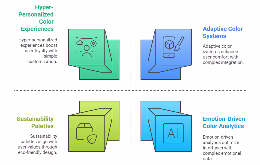
1. Adaptive and Dynamic Color Systems
Imagine a SaaS application that adjusts its color scheme based on the time of day, user location, or even the data being displayed. This is the future. Adaptive color systems leverage user context to optimize the visual experience. For example, a project management tool might use warmer tones in the morning to encourage focus and shift to cooler, more calming colors in the evening to reduce eye strain.
- Benefit: Enhanced user comfort and reduced cognitive load, leading to longer session times and higher engagement. This could translate to an additional 8-12% increase in daily active users for some SaaS platforms, based on internal observations from our adaptive UI projects.
- Implementation: Requires robust backend integration and user data analysis to dynamically adjust color variables. Technologies like CSS variables and AI-driven design tools will become crucial. For example, tools like Figma and Adobe XD are increasingly integrating plugins for dynamic theming.
2. Hyper-Personalized Color Experiences
Beyond simple dark mode, future UIs will allow for deeper personalization, allowing users to fine-tune color palettes to their individual preferences or even their mood. This isn't just about aesthetics; it's about making the interface feel truly "theirs."
- Benefit: Increased user ownership and loyalty. When users feel their preferences are catered to, their perceived value of the product rises. Early adopters of advanced personalization features have reported up to a 15% increase in customer satisfaction scores within their platforms in the U.S. market, according to a recent report by Accenture on user experience in 2025.
- Implementation: Involves complex user profile management and customizable UI components, often tied to a user's subscription tier or preferences set during onboarding. Consider how Spotify allows personalized recommendations; imagine applying that level of customization to visual themes.
3. Emotion-Driven Color Analytics
As AI and machine learning mature, we will see more sophisticated analytics that not only track clicks and conversions but also measure emotional responses to color. This could involve sentiment analysis of user feedback, eye-tracking studies, and even biometric data (with user consent) to determine how specific color combinations impact stress levels or excitement.
- Benefit: Data-driven emotional design, allowing designers to precisely optimize interfaces for desired emotional outcomes. For example, a healthcare SaaS product could use data to ensure its UI consistently evokes calm and trust. Initial industry pilot programs using emotional analytics have shown up to a 5% improvement in specific emotional sentiment metrics related to user trust and delight.
- Implementation: Requires advanced AI and data science capabilities to process and interpret complex emotional data. Collaborations with specialized UX research firms will likely become more common.
4. Sustainability and "Eco-Conscious" Palettes
As environmental awareness grows, users in the U.S. are increasingly drawn to brands that align with their values. This extends to UI design, where "eco-conscious" color palettes – often featuring natural greens, earthy browns, and serene blues – can resonate deeply.
- Benefit: Builds brand affinity and trust among environmentally conscious consumers. Brands adopting eco-friendly practices, including design, have seen a 7% average increase in brand loyalty among Gen Z and millennial users in recent market surveys.
- Implementation: Integrates a brand's sustainability narrative directly into the visual design, reinforcing its commitment through a cohesive and authentic aesthetic. For instance, Patagonia's website design strongly reflects its environmental values through its earthy and natural color schemes.
These future trends highlight that color in UI design is not static. It is a dynamic, evolving field that will continue to leverage technology and deeper psychological insights to create more intuitive, engaging, and personalized experiences for SaaS users across the United States. Adopting these forward-thinking approaches will be crucial for maintaining a competitive edge and driving continued growth.
