
Mobile App Development for Mid-Market Enterprises
Industry leaders trust us


.avif)


iOS Development | Android Development | React Native | Flutter | Cross-Platform | Enterprise Mobile Apps | Hybrid Apps
Built for Enterprise Workflows, Not Consumer Use Cases
Enterprise mobile applications operate in different conditions than consumer apps — offline capability, role-based access, integration with backend ERP and CRM systems, and security policies that consumer app stores don't enforce. We build for those constraints from architecture, not as afterthoughts during testing.
Cross-Platform Without Compromising Performance
React Native and Flutter deliver near-native performance for most enterprise use cases — one codebase, two platforms, significantly reduced build and maintenance overhead. Where native is genuinely required (device hardware, platform-specific APIs), we build native. The choice is driven by your requirements, not our preference.
Integrated With Your Backend From Day One
Mobile applications that work in isolation from enterprise systems create adoption problems. API contracts, authentication flows, and data sync architecture are defined before screen development begins — ensuring the app works with your ERP, CRM, and identity provider without integration sprints after go-live.
Accelerators That Power Our Mobile Development
Niral.ai — UI to Production Code
Niral.ai generates production-ready UI components from Figma designs for React Native and Flutter — compressing screen implementation time without sacrificing consistency between design and build.
ADaM — Backend & API Accelerator
ADaM's boilerplates, CRUD generators, and infrastructure provisioning scripts handle the backend scaffolding that mobile apps depend on — authentication, API endpoints, and data models set up in hours, not days.
Accelerators compress delivery time. Architecture determines whether the app scales beyond version 1.
What You Can Expect
Mobile app delivery that accounts for enterprise constraints — backend integration, security, device management, and long-term maintainability from the first sprint.
Six Mobile App Capabilities for Enterprise Products
iOS App Development
Native iOS applications for enterprise workflows — built for Apple device management, enterprise distribution, and integration with corporate identity providers.
→ Explore iOS App Development Services
Android App Development
Native Android applications optimised for enterprise device fleets — MDM compatibility, offline capability, and backend integration built in.
→ Explore Android App Development Services
React Native Development
Cross-platform mobile apps from a single codebase — near-native performance for enterprise workflows across iOS and Android.
→ Explore React Native Development Services
Flutter Development
Fast, expressive cross-platform apps with consistent UI across platforms — suitable for data-heavy enterprise interfaces and custom design systems.
→ Explore Cross Platform Development Services
Native App Development
Platform-native builds where hardware access, performance, or platform-specific APIs require it — no compromise where it matters.
→ Explore Native App Development Services
Enterprise App Development
Mobile applications built for internal enterprise use — field operations, approvals, inventory, and workflow tools integrated with core business systems.
→ Explore Enterprise App Development
Approach
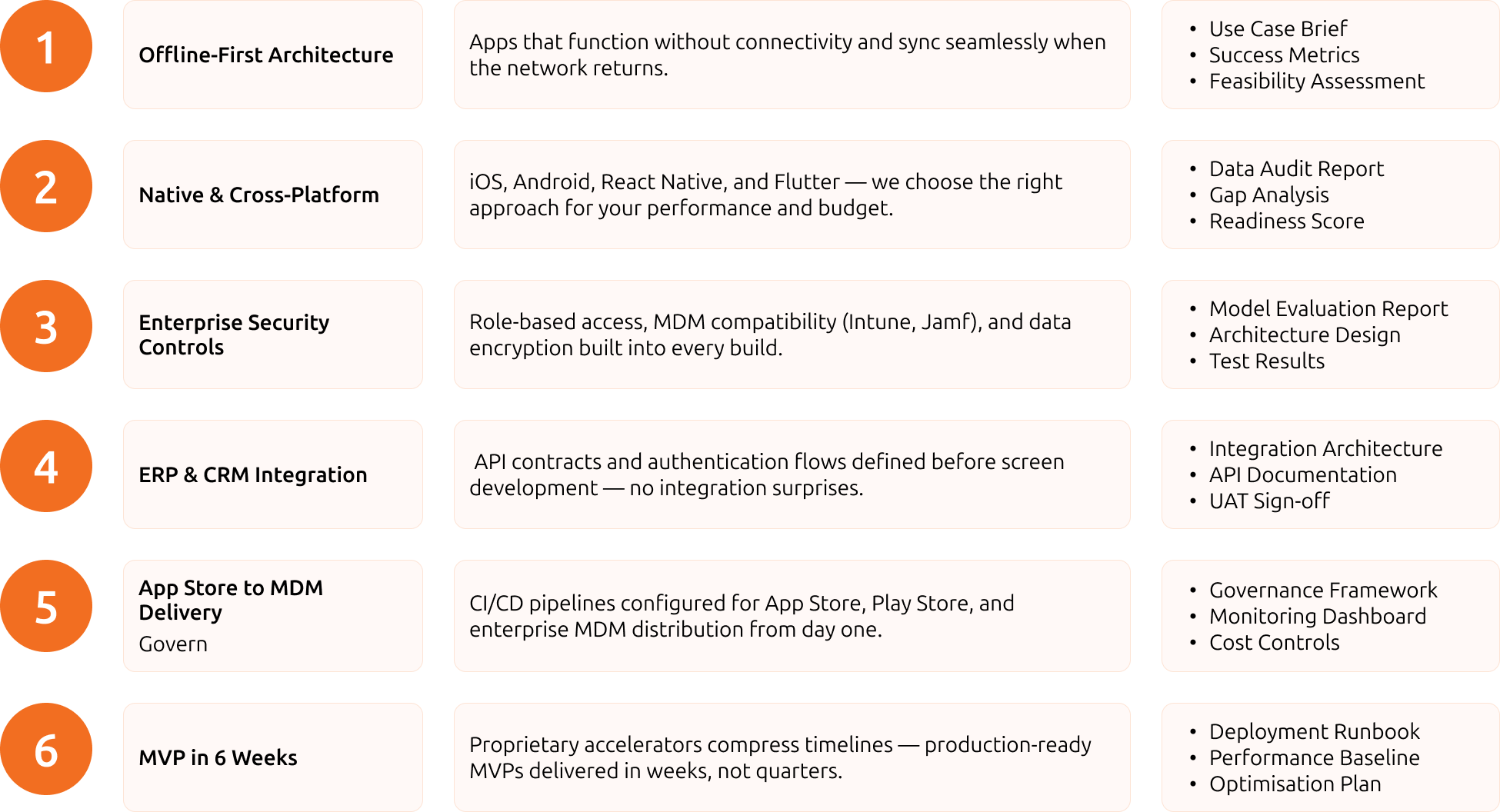
6 Pillars Of Our Modernization Approach
We leverage cutting-edge tools to ensure every solution is efficient, scalable, and tailored to your needs. From development to deployment, our technology toolkit delivers results that matter.
Tech Differentiator
Go Live in Weeks—Not Months
We leverage proprietary accelerators at every stage of development, enabling faster delivery cycles and reducing time-to-market. Launch scalable, high-performance solutions in weeks, not months.


Co-Engineering PODs

End to End Modernization Ownership

Project-Based Model


Frequently Asked Questions
What our clients say


Ship Mobile Apps Your Users Will Actually Use
